Interactive Social Media Banners
Concept, typography, and motion design for high-performing social ads (Instagram & LinkedIn). All formats can be tested directly in the browser and adapt flexibly to different campaign goals.
Maximum Contrast in the Feed
Bold headlines without distracting visual elements immediately stop the scroll. The toggle lets you switch directly between two tonalities – ideal for A/B testing or different brand settings.
Choose variant & color scheme:- Interactive call-to-action bar with hover state
- Staggered entrance animation (CSS keyframes)
- Responsive 4:5 feed aspect ratio for desktop & mobile
Visual Anchor & Clear Message
The upper visual area catches the eye in the feed, while the colored text block below delivers the core message without wastage. Test switching between 3D infographic and photography.
Choose visual & focus:- 55 / 45 split proportion for maximum readability
- Subtle image zoom on hover
- Optimized for illustrations, UI mockups & photos

Numbers That Convince Immediately.
Presentations & infographics for B2B decision-makers and boardroom pitches.
Portrait Focus & Clear Benefits
The vertical 50 / 50 split utilizes the full height of the 4:5 feed for vertical portraits or UI mockups. Right next to it, concise checklist arguments convince at a glance.
Choose scenario & focus:- 50 / 50 vertical split ideal for vertical portraits
- Staggered slide-in animation of the benefit list
- High scannability through checkmark structure
- Consistent campaign imagery through AI-assisted visuals
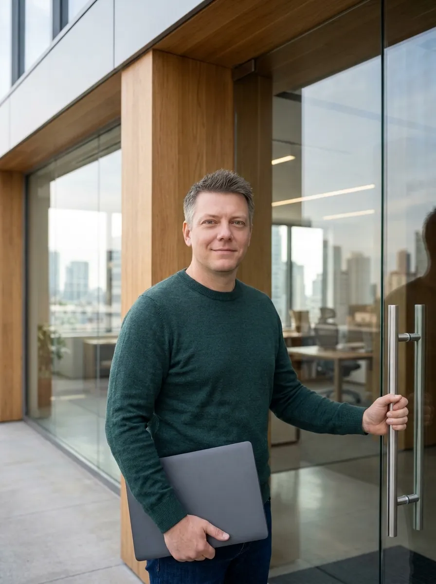
Looking to Strengthen Your B2B Team?
- ✓19+ years of B2B & agency experience
- ✓Ready to start immediately without onboarding
- ✓Presentations, UI & infographics